
Color Theory
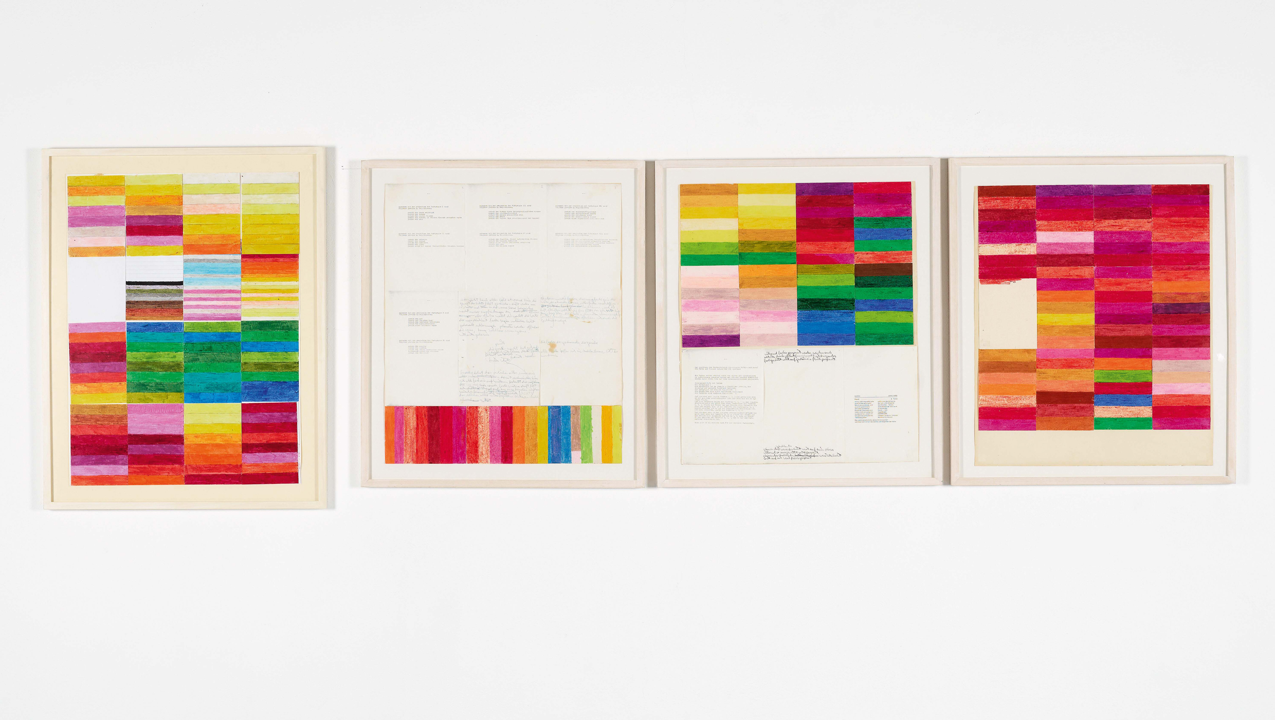
from 1979 to 1981 and, later, from 1989 to 1991, i taught a class for young, newly enrolled students at the art academy in frankfurt. the name of the course i taught was: “simple experiments in color and form.” my intentions were just to teach young people to foster an unprejudiced relationship to color. leaving the idea of great art aside for the moment, we were to simply combine beautiful colors. for this purpose the area of an a4-sized sheet of paper was subdivided into seven equally large parts. the objective was to juxtapose beautiful colors using oil crayons. following their instinct, each student had to combine colors they found beautiful and were in harmony with one another. the goal was to bring out the resonance of colors. we investigated the difference between random combinations of bright colors and genuine colorfulness. colors were understood as being analogous to sound. we put color harmonies together. the desired goal was to experience pure joy in color design – very much in the way we combine notes on an organ or piano to make a chord or melody – color combinations were to be tried out, discovered, and the colors combined in a harmonious way. bruckner was said to have often only strung together pure triads. the principles governing harmony in music are more rigid than in art, they are almost mathematical. in painting it is very different. art has no predefined set of harmonic principles we can fall back on, no stringent theory of harmony is possible. to a great extent, it remains a matter of subjective feeling to say what is beautiful in color, what colors have an ecstatic glow or radiance about them, what can be said to combine harmoniously. nevertheless, there are combinations of colors that are obviously consonant in some way, otherwise we could not speak of quality in painting or in the art of color. we speaks of the ecstasy of color intrinsic to the paintings of titian, tintoretto, veronese, or rubens; or we go into raptures over the fire of color in el greco’s pictures, over the golden-yellow, red-green glow of rembrandt’ artworks. vermeer, velasquez, and watteau present us with a palette of incredibly sensitive and subtle colors. and the impressionists discovered and opened up a new and hitherto-unknown world of colorfulness. van gogh, in turn, escalated their colorfulness to an ecstatic level.
thus i sought to open up my world of experience with colorfulness to my students by evaluating their work according to my criteria of judgment. very little of it has relevance at a general level. color harmony arises mostly when similar colors are applied next to one another. as, for example, red and orange tones, yellow and orange tones, color-tone transitions from violet to red, from violet to blue, yellow to green, green to blue, from cold tones to warm reds. in such cases, the main objective is to bring one or several colors to resonate in a harmonious structure. another option is to enhance the impact of colors by means of dissonance, by complementary colors. often the result is a flickering effect that intoxicates and enchants us – but that is just about all we can say about any predetermined conformity to rules. in another instance, the situation could be quite the opposite, and we are required to decide and reorganize anew. the ultimate overall scheme of harmony or form will always remain a mystery. in the end, as with music anything is possible despite its apparent regularity of structure.
i constantly dream of developing an art that is built upon harmony alone and rhythm and melody do not play a role: only pure resonance, consonance, color, purity of color, the beauty of juxtaposition and simultaneity of resonance, blending, glazes. we can hear it, it hardly makes a difference if i mean music or painting, whether i mean the art of sounds or of colors. in both cases, one speaks of colors and sounds, of harmonies and dissonances. the media overlap, the differences are negligible. musical sounds resonate in time, but interweave, blend in a moment to form harmonious combinations. painting spreads out over a surface, often simulating space, the colors (color tones) combine for a moment in the mind of the beholder in harmony (into a harmonious or disharmonious combinations).
it is only natural that art knows only the rule of absolute harmony, but it is often only through the mixture of harmony and dissonance that the final form, the work of art, first comes into being. in music i sought to realize my thoughts by just simply playing long drawn-out notes or chords (or bringing them to resound) simultaneously on the piano, harmonium, and organ. these studies were and are of the utmost importance to the music of the o. m. theater. in essence, my vision of music of the spheres can be realized via the idea of harmonics. the enjoyment of harmonies in a space of time. a long period of time is required in order to notice and enjoy harmonic constellations, therefore the notes and chords are made to resonate for an extended period. in music to date, harmonics is something that is savored too little, not enjoyed enough. the objective should be to meditatively enjoy harmonious situations in a state of uttermost intoxication. at its disposal we have the wealth of the ages, the infinite “space of time” of eternity. in the course of his long artistic career, albers found that placing squares within squares was the most simple form of representing, of illustrating color harmonies. i wish to go a step further and view the bare color range as the most ideal demonstration of color constellations and harmonious relationships. thus everything was prepared for students to try out different combinations impartially in practically endless possibilities and do as they wished with the abundance of harmonies with the goal of handling colors, learning to develop a feeling for color in order to later add design and invention and to paint pictures. pure color, the harmony of color, beyond the sphere of complicated art design and production, succeeds in conveying healthfulness, peace and quiet, calmness, vigor, joy and intoxication, as well as feelings and the emotions of grief, joy, pain, agony, fear, love. sequences of colors can represent catastrophes such as hurt, death, destruction, healing processes, convalescence, resurrection.
illness, hurt, destruction and death can be visualized.
finally I took up the idea of synaesthesia of the o. m. theater. i had color sequences designed according to their properties of being able to evoke a specific smell or perfume. or color sequences were drawn up, and for each color the corresponding smell or taste had to be chosen. together we discussed all the sheets and made an assessment of them (as i said, without having an accurate scientific evaluation method at our disposal). nevertheless, as we progressed with our experiments, we found more and more corresponded, our loosely based evaluation grew increasingly exact. i was thrilled with the students’ results, even though they initially could not make sense of the whole operation. they had, after all, enrolled at the academy to learn and practice producing complex and great art, and in my classes they were just creating simple color ranges. i am almost tempted to say that they were not yet ripe enough for simply creating combinations of colors, a practice that explores the roots of color combination. in the end, however, i believe just about each and every one of them saw the sense of our activities!
the quality of the results led me to try and generally grasp (plumb the depths of) the feelings which colors awaken in humans and utilize my findings for the color theory of the o. m. theater. one day i would like to compile all the best results of my students in a book in order to point out the color projections of the o. m. theater and the role that colors play in the o. m. theater framework. i view my class on color as the exposure to the demonstration of pure color, to the color harmonics of the o. m. theater. (1979-91/2007)